What is Branding?
Branding, as defined by the dictionary, is the promotion of a particular product or company by means of advertising and distinctive design. Personally, I believe it's more than just a textbook definition. Branding is all around us. It's in our walks down the street, our media consumption, and even our food is branded on neon billboards. Branding is now a fundamental part of our lives, and affects the way we think, act, and how we see the world. This is why it's so important to be good at branding, since we all know that you just skip past those brightly colored and ugly ads on cable TV. It is so important to be good at branding that your buisness will fail if the advertisements, packaging, and overall appeal is bad. Even if your product is heavenly and wonderful, no one will be drawn to it if you still have an outdated marketing strategy.
Starting out, branding can be a dautning task to achieve, and appears to be much harder than it looks. Truthfully, all you need to do is have a consistent theme, make meaningful choices in your designs, and keepyour main goal in mind while developing your company. Say for example, you're creating a brand that is in a crystal based jewlery making niche. To make it successful, you need to have a cohesive color scheme to make it stand out to viewers (say, in this example, a few shades of blue, white, gray, with a splash of yellow). Sticking to this theme, you have to make your cards, posters, brochures, designs, and logo all relating to it. In this case, you could have a sharp and dynamic edge to your design to represent the gems being used, and to add onto that, layer your work with sparkling or shiny finish. By doing this you're sticking to a consistent theme and adding that special flare that makes other buisnesses so successful.
Starting out, branding can be a dautning task to achieve, and appears to be much harder than it looks. Truthfully, all you need to do is have a consistent theme, make meaningful choices in your designs, and keepyour main goal in mind while developing your company. Say for example, you're creating a brand that is in a crystal based jewlery making niche. To make it successful, you need to have a cohesive color scheme to make it stand out to viewers (say, in this example, a few shades of blue, white, gray, with a splash of yellow). Sticking to this theme, you have to make your cards, posters, brochures, designs, and logo all relating to it. In this case, you could have a sharp and dynamic edge to your design to represent the gems being used, and to add onto that, layer your work with sparkling or shiny finish. By doing this you're sticking to a consistent theme and adding that special flare that makes other buisnesses so successful.
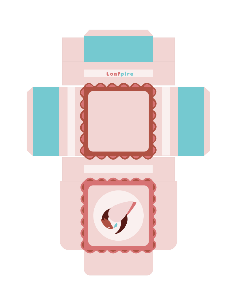
Loafpire
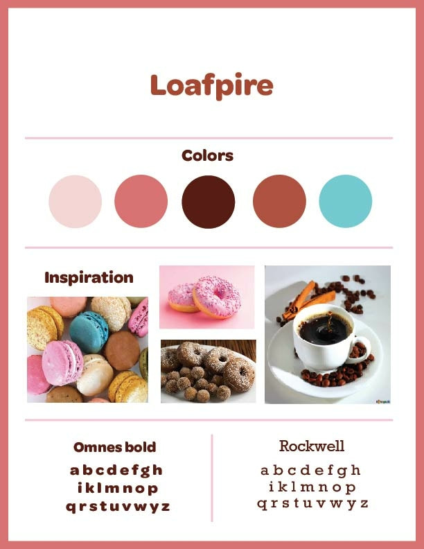
Brand BoardMy vision for my buisness, when I was still first starting out, was aimed to be themed brightly and colorfully, and to make the appeal mainly rely on the color scheme I used. This required my 5 color choices to be well-thought out with variety whilst making my brand board concept ideas.
Originally, it was mainly a collage of pink and orange colors, but there wasn't quite enough contrast to make it pop out to anyone looking at it, so I added a bright blue to the mix which fixd the problem. |
|
|
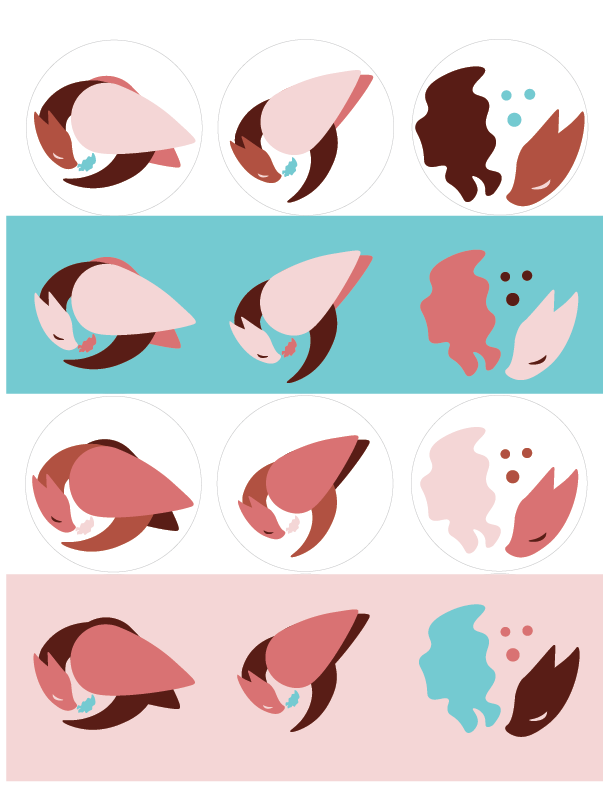
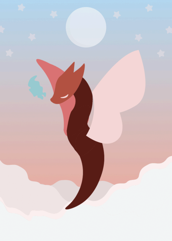
Sticker + LogoThe main logo for Loafpire (Top Middle Sticker) is a curved dragon with smoke coming out of it's nose. I made this logo with the curvature of a piece of croissant bread as it's original inspiration, as I'm designing for a bakery, but it evolved further from that after more development was underway.
My idea for the sticker pack was to use all the variations of logos I could think of. I changed the color contrast, the pattern, everything I could think of to change. The options were limited due to the limiting values in the colors I picked out to make sure they didn't blend into the background. |
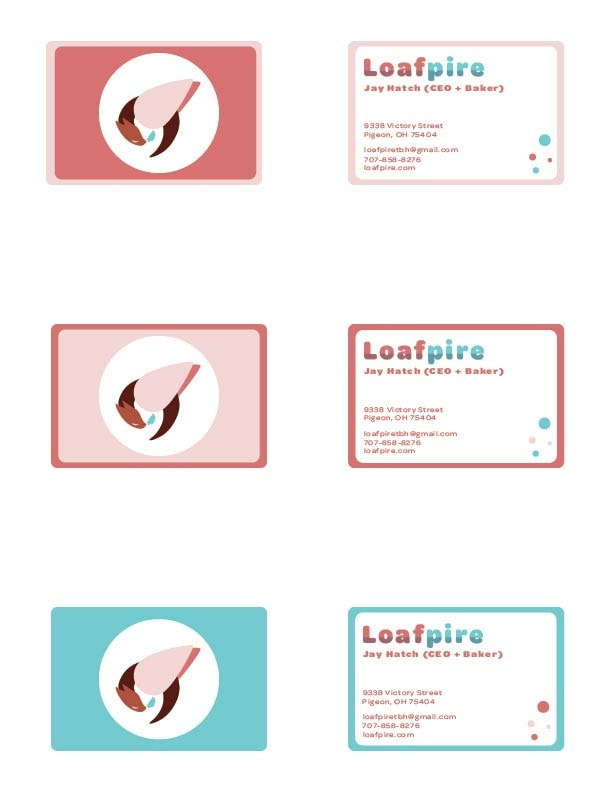
Buisness CardIn terms of creating a buisiness card, my vision was for it to be clean and simple to read, but add a splash of accent color and asymmetry to the overall design. I admittedly took inspiration from buisness cards online for the rounded and funky look to them, but obviously I made it my own.
The card I chose a s an official design was the middle one, chosen for the visual hierarchy and it's consistency with the blue accent. |
|
|
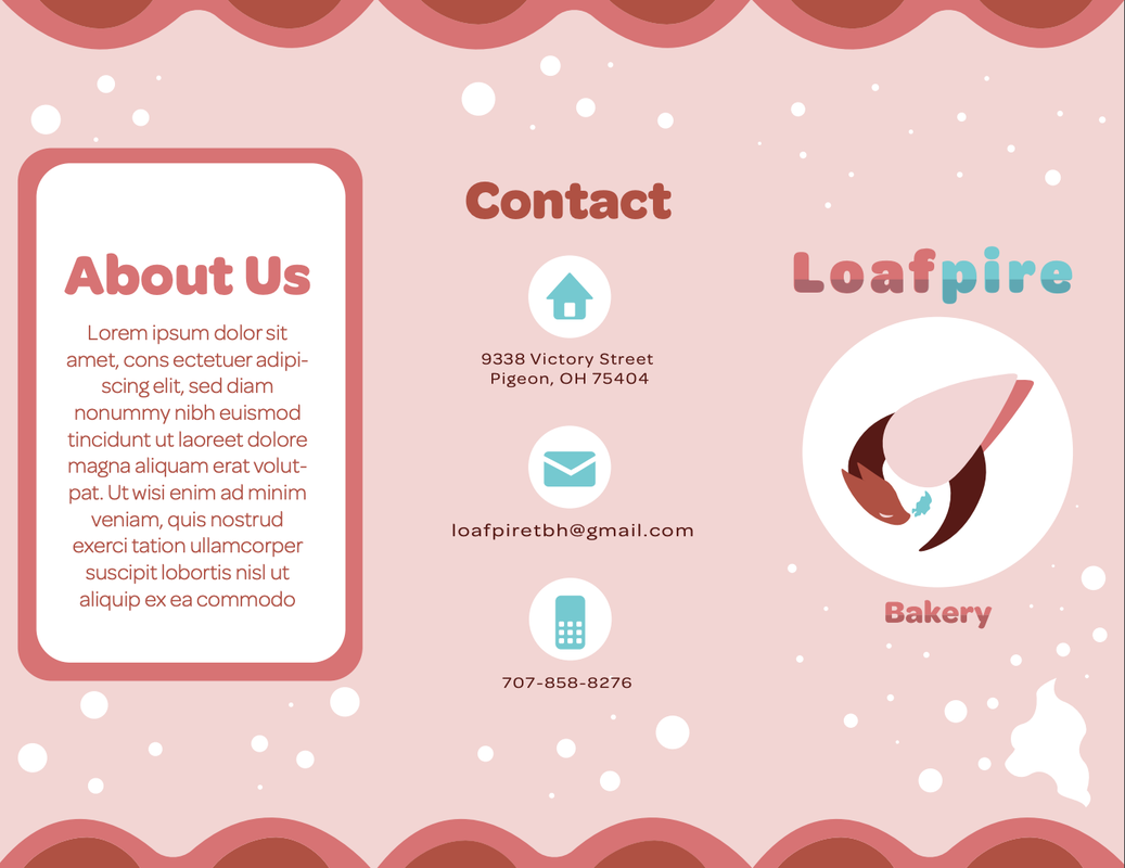
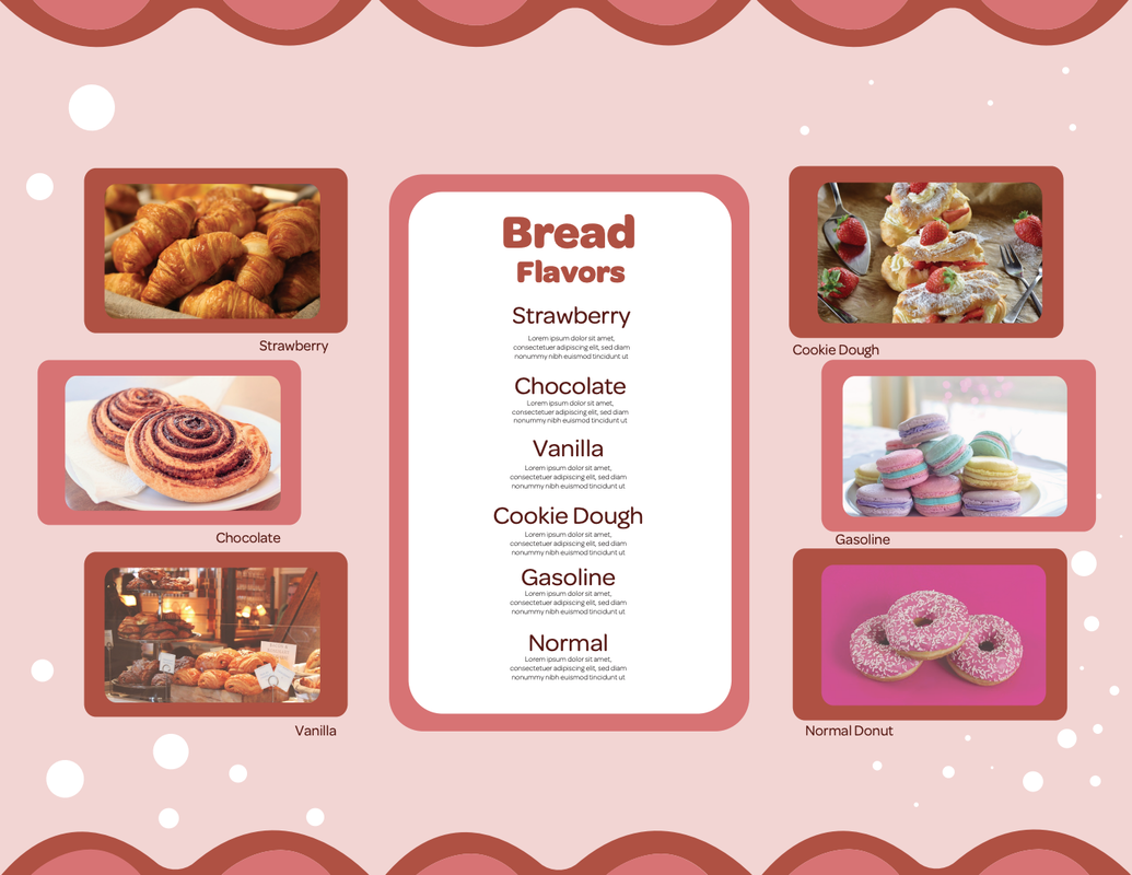
BrochureThis was probably the hardest assignment given to me because of the confusing and complicated layout that I had to rearrange way too many times. I wanted to include a sneak peek of a menu, a contact page, visuals, and a section to talk about the company itself. Of course, I didn't forget to include the Gasoline flavor, which started the idea of the whole buisness in the first place.
Despite this project being the hardest, it was the most rewarding in terms of hard work paying off. The little painstakingly places details were absolutely worth the finished project |
PackagingThis was absolutely the easiest project that was assigned to me. My company allowed for a packaging design in the formate of something that holds donuts, or cakes, or loaves of bread. This meant I could have an incredibly simple design with a clean layout and little complexity to it. Honestly I still really like the functionality of the box when it's printed out and my sister likes making these kinds of things too.
|
|
|
GIF AnimationMy GIF animation project was probably the easiest in terms of deciding where I wanted to go with it. I had a lot of time on my hands to develop it so it wasn't a high pressure assignment.
My goal for this assignment was to create a motion that encapsulated the theme I was trying to achieve, floaty and whimsical. I spent time trying out different ways to replicate how real animals fly and used a video of an eagle in flight as an animation reference for how to shape the wings. There is definitly more I could do to it but because of lack of motivation I decided this design was sufficient, |
